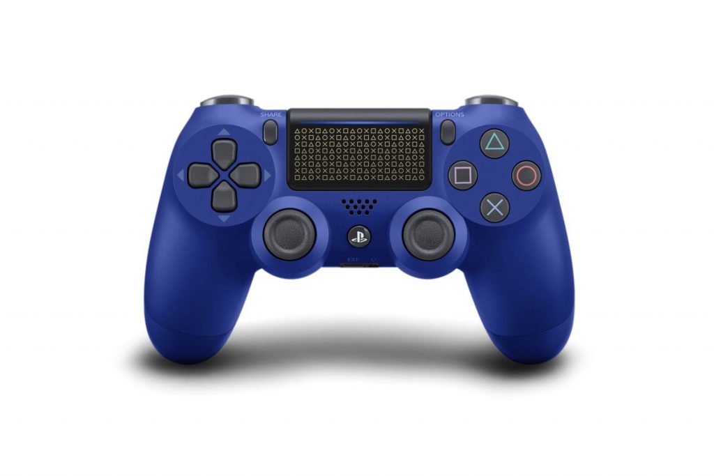
As you can tell by the opening paragraph, this isn’t going to be exactly objective. But I know exactly why I prefer the DualShocks, and by extension, the DualSense, over the competition. And that’s what I’ll be doing today. The reason is as simple as ergonomics. Even before the advent of analogue sticks, symmetry has always been key to good controller ergonomics. Your left and right thumbs mirrored each other when you reach for buttons. And when the analogue sticks were introduced for both sides of the controller, the same applied to them as well. Thus, their positions were perfect for what they did. Precise presses for buttons on the outside and broader, sweeping motions for analogue sticks on the inside.
One could make the opposite argument for the Xbox layout, no doubt. The common argument is that, while the face buttons are used more often than the right analogue stick, the left analogue stick also saw more use than the D-pad. And this use frequency explains why the the D-pad and the left analogue sticks had their position swapped. While the argument itself makes sense, it doesn’t necessarily translate well in practice. This is simply due to the purpose that buttons and sticks are used for, and the way they are used. After all, you don’t press down on analogue sticks for movement, the same way you don’t push D-pads to any direction besides downward. And if you do, keeping that motion while doing the opposite for the right side is like rubbing your belly and patting your head at the same time. Or rubbing on one thigh while patting the other. The only way anyone would prefer this over a mirrored experience on both sides is if they’ve never experienced it with the original DualShock, and went straight for the Xbox controller.
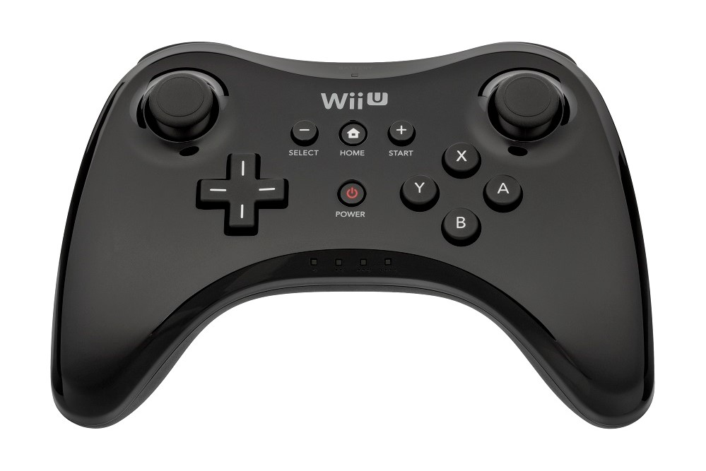
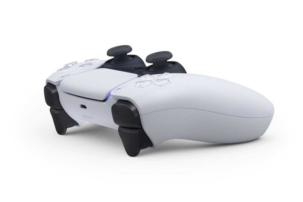
In fact, I’d much rather have both sides reversed completely. While it’s not ideal, but it would still make for a more relaxing experience. It’s also not as common, but the Nintendo Wii U Pro controller and, technically, the New 3DS use this layout. The latter of which I adored, in no small part thanks to Monster Hunter 4 Ultimate, as well as Pokemon X and Y. But I digress. Of course, the DualShock design is by no means perfect, even after four generations. When held in hand, it’s easy to argue that the Xbox controller feels more comfortable. But now that PlayStation has announced the DualSense, it’s not difficult to see in the silhouette that it has taken some cues from the Xbox controller. Now that it has good ergonomics for both the players’ thumbs and their palm when they hold the controller, the DualSense is one step closer to perfection.
But on the flip side, being merely closer to perfection means there’s room for improvement. For one, an option to switch from the standard 4-way D-pad to an 8-way one like the one on the Sega Mega Drive / Genesis would go a long way. This is especially for fighting games with strict diagonal input timing. Another improvement would be bringing back the pressure sensitive buttons of the DualShock 2, even if it’s a feature that not many games make use of. And let’s all agree that the DualSense could use some colour tweaks. Of course, this is all conjecture from someone whose left thumb instinctively dislocates itself whenever he picks up an Xbox controller. Will the DualSense really be all that? For now, no one but the folks who make it knows. After all, it hasn’t been in anyone else’s hands yet. But if seeing is believing, then I believe enough just from the official shots of the thing. And on that bombshell… (Image source: Wikipedia)


