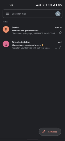
According to a report from 9to5Google, the general layout of Gmail Go is still similar to the full-fledged app. Even the swipe action for the e-mails in the main list, customisable left and right actions, and support for multiple accounts are still there on the Gmail Go app.
However, there are still some subtle differences that could be seen in Gmail Go including the presence of a new white outline along the search field. The compose button of the app is also shaped differently and there is also no bottom bar in the app. Not to forget, the logo of the app also has a Go label in it, so that users are able to differentiate between Gmail Go and the standard Gmail app. The Gmail Go app is already available for download on the Google Play, so do give it a try if you are using an entry-level Android phone at the moment. (Source: 9to5Google)
