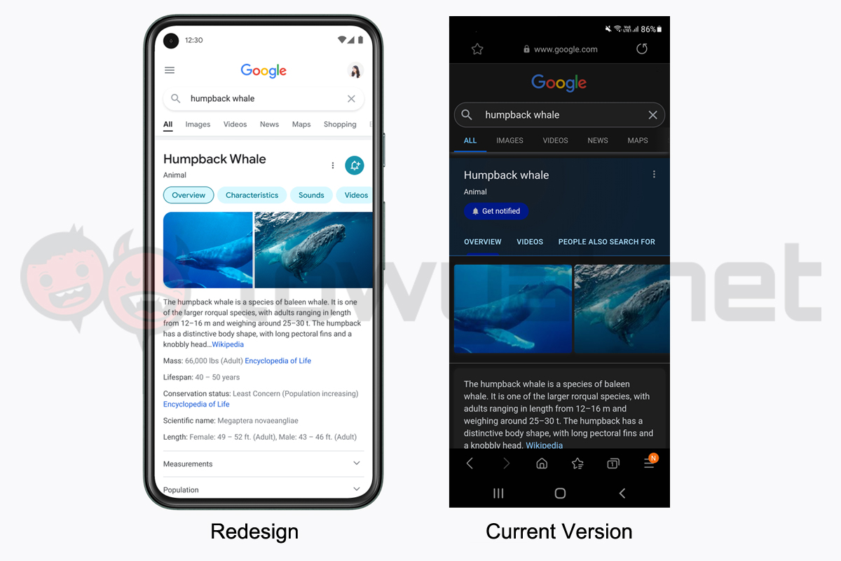
The designer says that the redesign will feature a cleaner interface with larger and bolder text, and will also use colours to highlight important information. The screenshots below compares the upcoming redesign provided by the company with the current look of Google Search captured on my Samsung S20 Lite. As you can see, relevant and important information will occupy more of the screen space than before.
In addition, segmented results will also take more width of the screen thanks to the introduction of a new edge-to-edge look and the removal of shadows. “The overall effect is that you have more visual space and breathing room for Search results and other content to take centre stage,” Cheng added.
Lastly, the designer says that the redesign will also feature a more “Googley” feeling to the Search interface. These include the introduction of more rounded elements to the icons and imagery, giving it a more “bubblier and bouncier” feeling. Google says that the mobile Search redesign will roll out to both Android and iOS platforms in the coming days. (Source: Google [Official blog])

